Converse Catalog
Publication
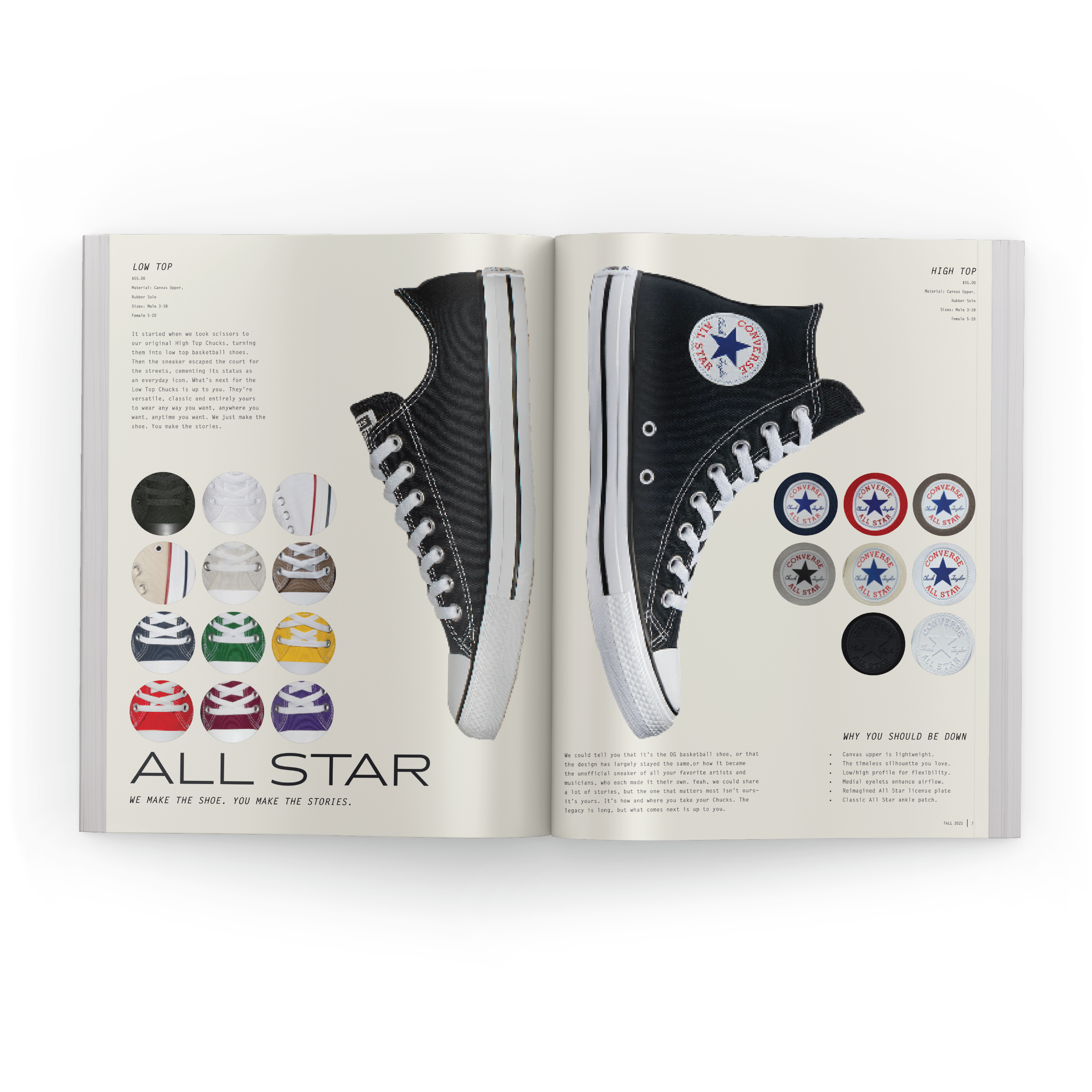
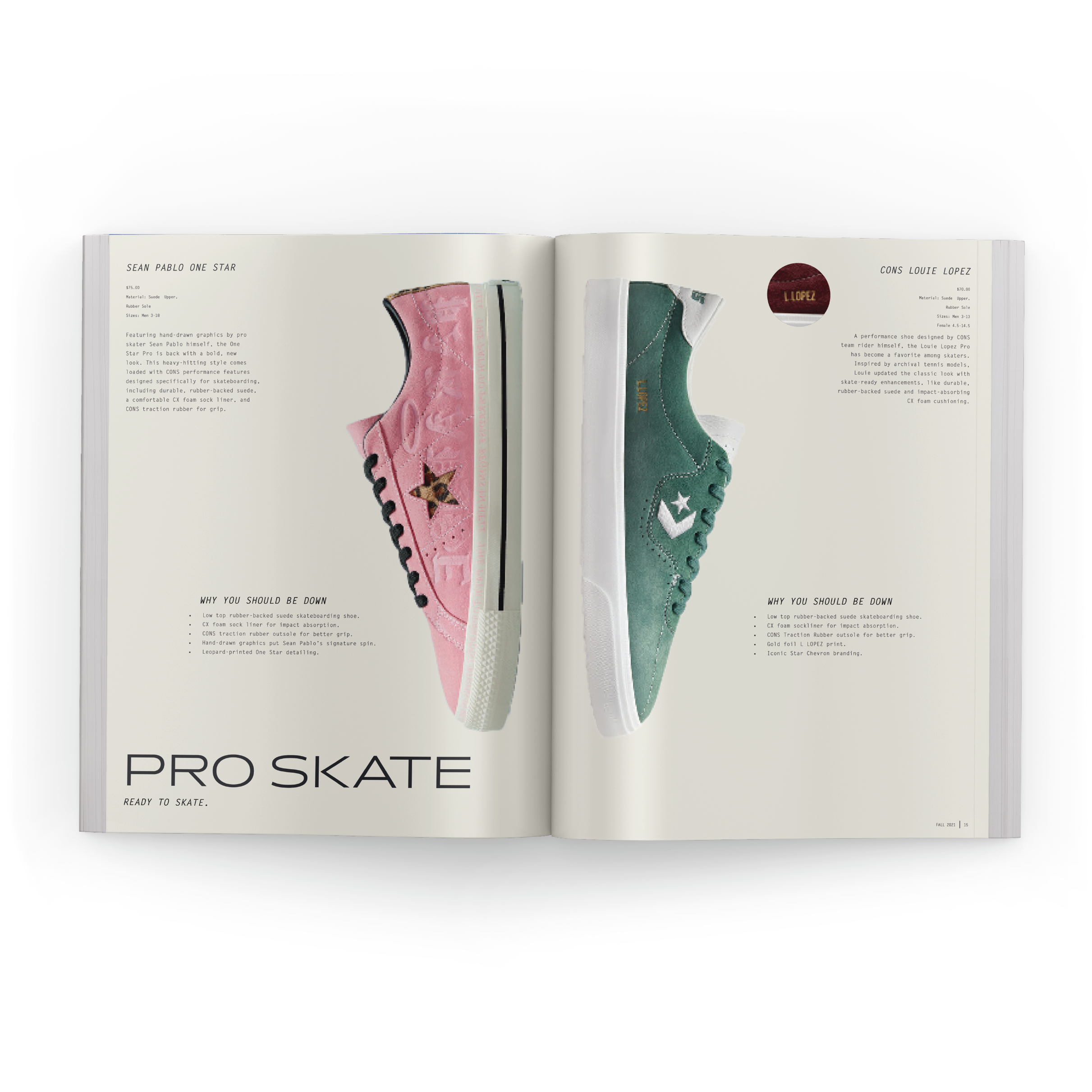
For this Converse catalog, I wanted to go out of my comfort zone and try a more minimalistic, clean style in order to challenge myself. I choose to use whitespace to allow the content to speak for itself while highlighting the key attributes of the shoes. It was important for me to have the shoes be the most important element on the page, as well as, all the different color variations of each style. Converse being such a well-known brand, I wanted to take a step back and try not to oversell a product that sells itself.


It was important to include all the color options within the catalog to show off the diversity of the shoe. The lifestyle spread supports this by using real customer reviews and photos that showcase the individual’s style. The ‘Fix ‘Em Up’ page is meant to show that they are long-lasting shoes that can still be used even when they have been well loved.


